Exercises#
Jupyter Lite session
Start a Jupiter lite session here to open a new tab where you can freely write and run your code.
Wait until the message “You may begin!” is printed.
Histogram of mountain heights#
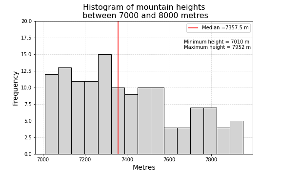
Your task is to reproduce the plot shown below using the dataset with all mountains above meters, mountains_above_7000m.csv file. The characteristics of the plot are the following:
15 bins histogram of mountain heights in metres
minimum and maximum values placed in text box
vertical red line representing the median value
title font size = 16
x and y labels font size = 14
legend font size = 10
dashed grid placed behind the histogram

Toolbox
Here are your tools to solve this exercise:
Define the input variable.
Get the maxim, min and median values of the input variable.
The vertical line can be plotted using
matplotlib.pyplot.vlinesThe min an max values can be plotted using
matplotlib.pyplot.text
You can use the following matplotlib.pyplot functions (but not limited to):
plt.figure(), plt.ylim(), plt.title(),plt.legend(),plt.rc()
More information:
Note
On Jupyter lite use the following line to load the data file:
mountains_7000 = pd.read_csv('/drive/data/mountains_above_7000m.csv')
Bar plot of number of mountains per country#
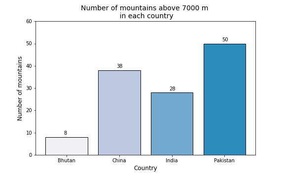
Your task is to reproduce the plot shown below using the dataset with all mountains above 7000 meters, mountains_above_7000m.csv file. The characteristics of the plot are the following:
Bar plot representing the number of mountains above 7000 meters per country
The countries to be included are: Bhutan, China, India and Pakistan
The color hex color codes that represent each country are : #f1eef6, #bdc9e1, #74a9cf and #2b8cbe
title font size = 14
x and y labels font size = 12

Toolbox
Here are your tools to solve this exercise:
Define a list of the countries of interest.
Compute the number of mountains per country (see Exercise 6.5.3 for example).
Define a list of the given hex color codes.
The bar plot can be plotted using
matplotlib.pyplot.barUse a for loop to place text representing the number of mountains above each bar
You can use the following matplotlib.pyplot functions (but not limited to):
plt.figure(), plt.ylim(), plt.xlabel(),plt.ylabel()
More information:
Note
On Jupyter lite use the following line to load the data file:
mountains_7000 = pd.read_csv('/drive/data/mountains_above_7000m.csv')
Plot of two variables#
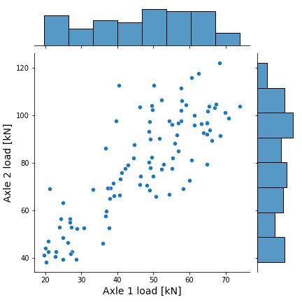
Your task is to reproduce the scatterplot with marginal histograms shown below. The dataset to be use is the sample of 100 vehicles corresponding to the 3-axle vehicle type 3C located in the file 02_01.csv. The characteristics of the plot are the following:
For this task you will use different Python data visualization library called seaborn
Scatter plot with marginal histograms representing the Axle 1 and Axle 2 measurements
x and y labels font size = 14

Toolbox
Here are your tools to solve this exercise:
Get the variables of interest (Axle 1 and Axle 2).
The scatter plot with marginal histograms can be plotted using
seaborn.jointplot
More information:
Note
On Jupyter lite use the following line to load the data file:
dataset = pd.read_csv('/drive/data/02_01.csv')
