3.3. Scatter plot.#
A scatter plot is a type of plot used to display the relationship between two variables. In civil engineering, scatter plots can be used to analyze various aspects of data. Let’s consider a scenario where civil engineers are studying the relationship between the compressive strength of concrete and the curing time. To investigate this relationship, the engineers collect data from concrete samples. For each sample, they measure the compressive strength after different curing times. The collected data might look like this:
Curing Time (days) |
Compressive Strength (MPa) |
|---|---|
3 |
18 |
7 |
28 |
14 |
38 |
21 |
46 |
28 |
55 |
To visualize this data, the engineers can create a scatter plot, where the x-axis represents the curing time in days, and the y-axis represents the compressive strength in megapascals (MPa). Each data point in the plot corresponds to a specific curing time and the corresponding compressive strength. By examining the scatter plot, the civil engineers can observe the trend or pattern of the data points. They can determine if there is a correlation between curing time and compressive strength, and analyze how the strength changes with the increase in curing time.
Let’s create the corresponding scatter plot:
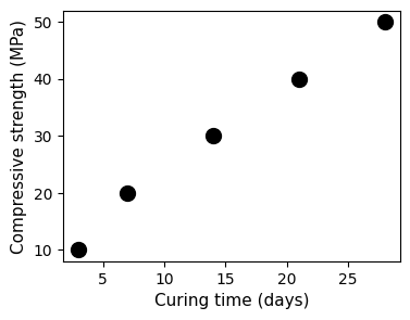
curing_time = [3,7,14,21,28]
compressive_strength = [10,20,30,40,50]

fig, ax = plt.subplots(figsize = (4,3))
ax.scatter(curing_time, compressive_strength, color='black', s=100)
ax.set_xlabel('Curing time (days)', fontsize=11)
ax.set_ylabel('Compressive strength (MPa)', fontsize=11)
plt.show()
Let’s break it down
curing_time = [3,7,14,21,28]andcompressive_strength = [10,20,30,40,50]: These lines define two lists representing the curing time and corresponding compressive strength data points.fig, ax = plt.subplots(figsize=(4, 3)): This line creates a plot with a figure size of 4 units wide and 3 units high. The plot will contain the figure (fig) and axes (ax) objects.ax.scatter(curing_time, compressive_strength, color='gray', s=100): This line creates a scatter plot using the data fromcuring_timeandcompressive_strength. The dots are colored gray and have a size of 100 units.ax.set_xlabel('Curing time (days)', fontsize=11): This line sets the x-axis label as ‘Curing time (days)’ with a font size of 11 units.ax.set_ylabel('Compressive strength (MPa)', fontsize=11): This line sets the y-axis label as ‘Compressive strength (MPa)’ with a font size of 11 units.plt.show(): This line displays the plot on the screen.
Note
Notice the line fig, ax = plt.subplots(figsize=(8, 6)).
When plotting with matplotlib, we often work with two main objects: the figure (fig) and the axes (ax).
The figure (
fig) is the entire window or page that everything is drawn on.The axes (
ax) represents the actual plot or chart area within the figure.
This is special helpful when dealing wit multiple subplots.